 It has been said that sometimes great design is great because you don’t notice it. It brings you the information you need without you having to struggle but doesn’t impress itself upon your mind, unless of course you are looking for it. Design, when it is good, can be an unsung hero that enhances your experience but for the most part goes unrealized. This is no less true when it comes to manga page layout. There are a lot of approaches to page layout to be sure, but I’m choosing to focus on Swan because it accentuates manga design so well and is an amazing sight to behold. (I apologize for the crease in my scans; all images can be enlarged)
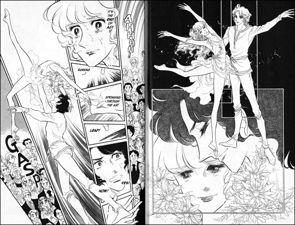
The most basic function is obviously to lead the reader’s eye through the story. But page design can do so much more. Using the above image you can see the calm of the right page contrast with the chaos of the left. This chaotic feeling is achieved through the angles of the boxes and the way they fit together. From this a momentum starts to build up. Then the way the dancer is swept into the air where her toe points into the negative space your eye follows through the action. You literally might find yourself taking a breath like the gasp the audience utters as the movement leads you to the next page. Moving on to another example, the following spreads come one after the other.

 On the advice of
