Visual Novel Logos Part 2: Bloggers just wanna have fun!

We return for round two of our analysis of the commonalities of  visual novel logo designs. Last time we looked at the similarities of crying girl games. This time we are looking at fun/comedic bishojo visual novels. This was the second type of logo that stood out just as strongly as the sad girls in snow games. They too have this distinct easily recognizable formula to their logo design that instantly tells you what sort of game you are picking up before you see anything else.

What originally struck me about bishojo game logos was that even though they are marketed for guys, the logos are distinctly what you would image seeing for elementary/middle school girls or you could even image them being drawn by said young girls. This sent me on a quest to compare the two.

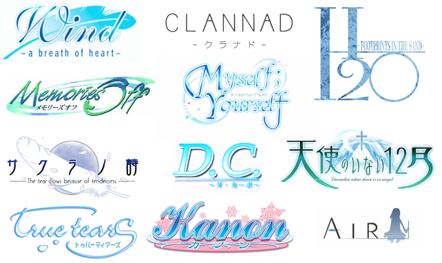
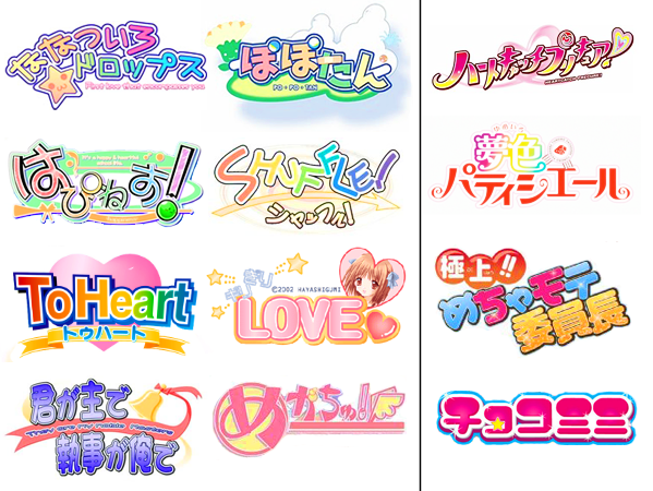
These are the happy fun visual novels usually based around comedy. Unlike the crying girl games which are supposed to invoke a feeling of the beauty of sadness these games are supposed to be an energetic tribute to hot girls. And having sex with said hot girls. The lettering of the logo is always big and bold with rainbow colored letters. There is then a subtitle with smaller uniformly colored text but if tends to be just as neon crayon colored as the title itself. The lettering seems to bounce around. Although how asymmetrical it is varies from logo to logo. There is usually a colorful abstract shape in the background and/or mascot along side everything else. The Shuffle! logo is a perfect example with it’s pastel rainbow colored logo, colorful whirlpool in the background and it’s uniformed colored arrow and much less rainbow colored subtitle. Overall I feel that the logo is supposed to invoke a lighthearted festival feeling. They are meant to invoke a fun, energetic, humorous feel. I have to agree 100% with what Narutaki said about the designs looking like they were draw by an artistically talented elementary school student or at least something aimed at said student.

You can click the image above to show more logos and also see a comparison to logos made with young girls as the target audience, more on that in a few. What hits you first when looking at these bishojo game logos side by side is the overall color palette which immediately brings out a light-hearted feel and removes even a remote possibility of worries (unless you’re worried about having too many girls to choose from). Even without the mascot or icon that many like to add in to these designs, there is a sense of fun and energy present. The actual type can vary but it always has a boldness to it and the use of a double stroke, usually a white or light thick stroke around the type followed by a black or dark thin stroke. The color palette here is bright, but when looking at the logos for young girls, you can see they are in the same vein but tend to be more saturated. The visual novel logos are actually more feminine, more girly than the ones actually aimed at girls. If I may be philosophical for a minute, it’s like the difference between what girls are like and what guys think girls are like. But commonalities should be clear including the boldness, the off kilter line of type, and the use of strokes. They actually evoke the same feelings (well, minus all that fan-service)!

I am once again curious if other people agree with our observations or have other good examples to add to our case files. The next one should wrap this series up unless someone wants to provide some examples for different distinct genre design. Please look forward to our next visual novel logo article.

Visual Novel Logos: Part 1 Part 3

Visual Novel Logos Part 1: . . . sad bloggers in snow . . .

This all started with a random observation. Narutaki and I were looking over what shows we wanted to sample from the new season of anime. While researching one title we had not heard of we went to the series’ homepage and I instantly knew the anime was based on a visual novel from nothing more than the title treatment. This sparked the realization that there was a common design theme in visual novel logos with similar content. I then researched over 200 visual novel logos to assess the commonalities in design.

In a rare, though interesting turn, we take a look at the logos of visual novels purely from the point of view of design. Even though the famous saying is “don’t judge a book by it’s cover,” you can actually tell a lot from them! This is less of a conversation and more of an observation. Unfortunately, we can’t for the life of us remember what that show was that started this whole thing! But thank you show, wherever you are.

The first major group we discovered is centered around “crying girl games.” Crying girl games, as exemplified by Key games, usually send the player through an emotional roller coaster and are famous for getting their audience to cry during the most tragic scenes. First take a look at all the crying girl game logos we have at the top. They usually have thin blue letters sometimes with black or green as an accent. There is usually some type of subtitle included. There is usually an item in the background, feathers were particularly popular but other light symbols or abstract shapes were used as well. Overall I feel this design aesthetic is trying to invoke that same feeling of the beauty that can be found in sadness and loss that the game attempt to do. The logo for Wind: A Breath of Heart is an exemplary example if this aesthetic style.

Oh, you can click that image up and there and you will see a bunch more logos to examine. The first thing that hits me is the color palette and an almost exclusive use of the color blue, of course often associated with sadness, as the primary and then green coming up sometimes. The type is rendered in thin, clean strokes with a tendency towards flourish or script styles. While the color palette is rather gender neutral, the type seems distinctly feminine but possibly in an innocent form. I also included the three most popular Key game properties to show some differences. Take the Kanon logo, with its use of pink it really stands out and it also looks much more childish. The Air logo falls close to the others in its field. Then the Clannad logo, while still holding on to the thin strokes falls much more to modern and minimal, practically giving away nothing about itself in its design. The feeling of these logos evoke to me is whismy, softness, and a hint of melancholy.

I am curious if other people agree with our observations or have other good examples to add to our case files. And this is only the first in the series! Please look forward to our next visual novel logo article.

Visual Novel Logos: Part 2 Part 3

The thin line between moe and masturbation.

Talking about moe was the third article we ever did for the blog. Moe is, for a wide variety of reasons, a topic that Narutaki is forced to discuss and debate with me on a regular basis. So this is an article that has been fermenting in our minds for quite awhile. A small discussion about the nature of moe and sexuality broke out on twitter. Scott VonSchilling was arguing that moe and sexuality are separate traits and should not be considered connected. I then used one example that turned the whole conversation into a fire storm of debate, Mikuru Asahina. She is a character who is famous for being extremely moe and extremely sexualized but more importantly sexualized for and by her moe. The conversation quickly spiraled out of anyone’s control.

It has been many moons since we last discussed this growing term and I don’t even remember what spurned on our first article. I honestly try to avoid such discussions when I can, it’s true but it still comes up pretty often whether I see it on Twitter or on a bus ride to Otakon. Sometimes I participate and sometimes I just take in the discussion going on around me. Moe, everyone’s got an opinion about it so what we are adding here is not just our overall perspective on the genre/term/thing, but rather a specific instance of it.

As I mentioned in our Otakon 2009 report I am still not sure people in the anime business in Japan comprehend the full meaning of moe let alone anyone else. I am better at defining what moe is and detecting it when it exists in a show but on the other hand I am still light years away from a perfect understanding or acceptance of the term. As far as I can tell moe has maintained its bizarre dual meaning. In a general sense it means an attraction and devotion to any trait. You can be moe for maids with glasses, blond boys who are in gangs, or curry joints that serve their dishes on trains. In a more specific, pure, and otaku sense it means the desire to protect weak characters that cannot protect themselves. In its ideal and stated definition there is no sexuality in moe. You want to protect the moe character and have a chaste love for them. Some describe it as a fatherly need to protect and nurture someone weaker. This more specific definition is the one that causes the most problems and is the focus of the discussion.

Up until a couple of years ago I had no idea this word even existed or held a place in fandom. Obviously, since then a lot of anime watching has happened, a lot of reading has gone on, and numerous discussion have taken place and still there is no consensus on what exactly moe is. Luckily, we are telling you which popular theory of the word is up for debate. Moe is about security and affection given through supporting and protecting a character who for some reason can’t do so on their own. There are a myriad of reasons why characters exude this need. Despite the many things I could say about this scenario (and the many problems that arise), they aren’t all relevant to this particular discussion. It’s worth noting that while some moe characters are very young, many fall into the high school age so always equating moe and lolicon is a stretch even though that is a popular assumption. And by extension moe does appeal to the lolicon crowd. However, what is important for the current theory we are undertaking is that the characters aren’t supposed to elicit eroticism but rather endearment.

Continue reading