![]() This all started with a random observation. Narutaki and I were looking over what shows we wanted to sample from the new season of anime. While researching one title we had not heard of we went to the series’ homepage and I instantly knew the anime was based on a visual novel from nothing more than the title treatment. This sparked the realization that there was a common design theme in visual novel logos with similar content. I then researched over 200 visual novel logos to assess the commonalities in design.
This all started with a random observation. Narutaki and I were looking over what shows we wanted to sample from the new season of anime. While researching one title we had not heard of we went to the series’ homepage and I instantly knew the anime was based on a visual novel from nothing more than the title treatment. This sparked the realization that there was a common design theme in visual novel logos with similar content. I then researched over 200 visual novel logos to assess the commonalities in design.
![]() In a rare, though interesting turn, we take a look at the logos of visual novels purely from the point of view of design. Even though the famous saying is “don’t judge a book by it’s cover,” you can actually tell a lot from them! This is less of a conversation and more of an observation. Unfortunately, we can’t for the life of us remember what that show was that started this whole thing! But thank you show, wherever you are.
In a rare, though interesting turn, we take a look at the logos of visual novels purely from the point of view of design. Even though the famous saying is “don’t judge a book by it’s cover,” you can actually tell a lot from them! This is less of a conversation and more of an observation. Unfortunately, we can’t for the life of us remember what that show was that started this whole thing! But thank you show, wherever you are.
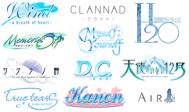
![]() The first major group we discovered is centered around “crying girl games.” Crying girl games, as exemplified by Key games, usually send the player through an emotional roller coaster and are famous for getting their audience to cry during the most tragic scenes. First take a look at all the crying girl game logos we have at the top. They usually have thin blue letters sometimes with black or green as an accent. There is usually some type of subtitle included. There is usually an item in the background, feathers were particularly popular but other light symbols or abstract shapes were used as well. Overall I feel this design aesthetic is trying to invoke that same feeling of the beauty that can be found in sadness and loss that the game attempt to do. The logo for Wind: A Breath of Heart is an exemplary example if this aesthetic style.
The first major group we discovered is centered around “crying girl games.” Crying girl games, as exemplified by Key games, usually send the player through an emotional roller coaster and are famous for getting their audience to cry during the most tragic scenes. First take a look at all the crying girl game logos we have at the top. They usually have thin blue letters sometimes with black or green as an accent. There is usually some type of subtitle included. There is usually an item in the background, feathers were particularly popular but other light symbols or abstract shapes were used as well. Overall I feel this design aesthetic is trying to invoke that same feeling of the beauty that can be found in sadness and loss that the game attempt to do. The logo for Wind: A Breath of Heart is an exemplary example if this aesthetic style.
![]() Oh, you can click that image up and there and you will see a bunch more logos to examine. The first thing that hits me is the color palette and an almost exclusive use of the color blue, of course often associated with sadness, as the primary and then green coming up sometimes. The type is rendered in thin, clean strokes with a tendency towards flourish or script styles. While the color palette is rather gender neutral, the type seems distinctly feminine but possibly in an innocent form. I also included the three most popular Key game properties to show some differences. Take the Kanon logo, with its use of pink it really stands out and it also looks much more childish. The Air logo falls close to the others in its field. Then the Clannad logo, while still holding on to the thin strokes falls much more to modern and minimal, practically giving away nothing about itself in its design. The feeling of these logos evoke to me is whismy, softness, and a hint of melancholy.
Oh, you can click that image up and there and you will see a bunch more logos to examine. The first thing that hits me is the color palette and an almost exclusive use of the color blue, of course often associated with sadness, as the primary and then green coming up sometimes. The type is rendered in thin, clean strokes with a tendency towards flourish or script styles. While the color palette is rather gender neutral, the type seems distinctly feminine but possibly in an innocent form. I also included the three most popular Key game properties to show some differences. Take the Kanon logo, with its use of pink it really stands out and it also looks much more childish. The Air logo falls close to the others in its field. Then the Clannad logo, while still holding on to the thin strokes falls much more to modern and minimal, practically giving away nothing about itself in its design. The feeling of these logos evoke to me is whismy, softness, and a hint of melancholy.
![]() I am curious if other people agree with our observations or have other good examples to add to our case files. And this is only the first in the series! Please look forward to our next visual novel logo article.
I am curious if other people agree with our observations or have other good examples to add to our case files. And this is only the first in the series! Please look forward to our next visual novel logo article.
Visual Novel Logos: Part 2 Part 3


I had kind of noticed this before, but hadn’t realized just to what great extant this was true. Excellent work, detectives.
@BakaTanuki Well there are a few other logo trends we noticed. So get ready for round two soon! (AKA is this supposed to appeal to middle aged guys or 10 year old girls?)
– Hisui
Interesting. I can’t tell the difference between animes based on visual novels or not but I see what you mean. They all look the same to some degree.
Also it be funny to see that Reverse Thieves logo on the main banner for a day or so. haha
I love the Clannad logo because it breaks most of the conventions of the genre… Just like how the game really does break some of the conventions in the genre by going beyond the usual scope of a VN and create a much larger scenario.
And then there’s the Little Busters! logo, which doesn’t quite fall in this category, despite it also being a Key game.
It’s a weird game, as it is, at its core, a VN, and yet all those minigames, experience points and items make it not quite so. And for all that, it’s still, without a doubt, a Key game, and a crying girl game.
To sum it up, I agree completely. I tried explaining this to my logo designer for my OEL VN, and I had a hard time doing it (though it must have worked well since I like the final product). I think the logo is an important part of a game’s aesthetic since it appears everywhere from the website to the title screen. It’s more important than the box art if you ask me. A well-designed logo can genuinely tempt the reader into clicking, especially if the general “feeling” of the image matches the story and themes of the game.
Also, you hit the nail on the head with your personal VN-style logo. Good job :D
To look at logo for key games, you also have to keep in mind that there’s a progression:
kanon->air->clannad->little busters
Then it all makes sense. Maybe also look at ONE.
http://en.wikipedia.org/wiki/One:_Kagayaku_Kisetsu_e