
![]() Ah, Tachikoma, how I longed to have you for my own for so long. Okay, so he is a little far from having the real deal, but I’ll take what I can get. He is die-cast metal, I was a bit worried there would be a balance issue what with that huge back end, but no problem! The articulation in his legs is good and his feet and hands are fully poseable. As you can see his crouching position is quite nice. However, his arms don’t fair as well. If I try to give him a sort of excited yatta Tachi pose, they don’t really reach high enough and tend to pop off. But overall he is a good size and detailed making him one of the best I’ve seen avaliable. He also comes with software that allows his to say phrases and light-up and move a little. Though the CD is for Japanese PC only (which of course you can get around).
Ah, Tachikoma, how I longed to have you for my own for so long. Okay, so he is a little far from having the real deal, but I’ll take what I can get. He is die-cast metal, I was a bit worried there would be a balance issue what with that huge back end, but no problem! The articulation in his legs is good and his feet and hands are fully poseable. As you can see his crouching position is quite nice. However, his arms don’t fair as well. If I try to give him a sort of excited yatta Tachi pose, they don’t really reach high enough and tend to pop off. But overall he is a good size and detailed making him one of the best I’ve seen avaliable. He also comes with software that allows his to say phrases and light-up and move a little. Though the CD is for Japanese PC only (which of course you can get around).
![]() I recently got a copy of Stolen Hearts by Miku Sakamoto from CMX. Shinobu Okuma is a super short girl who accidentally spills milk all over an expensive kimono that the frightening Koguma brought to school with him. He shames her into working at his grandmother’s kimono shop where she slowly sees that he’s a sensitive guy and not the wannabe Yakuza everyone thinks he is. It is a cute story. I was a bit surprised that by the end of the first chapter Shinobu and Koguma are a couple. Part of me wonders if this was supposed to just be a one shot story that was popular enough to get turned into a series. The first chapter could so easily be self-contained. The characters are solid and entertaining. Everything works really well when Shinobu and Koguma are interacting. My main problem is the story tends to lean on shojo tropes too much and whenever it does so it is at its weakest. The story really shines when its characters are doing something a little outside the mold. It’s a fun read but it is not going to win over any new fans to the genre. I did find the teen rating on the back quite curious. This manga is super chaste. Maybe it gets racier down the line but so far the most anyone does is some hand holding. The only fan service is traditional Japanese clothing service.
I recently got a copy of Stolen Hearts by Miku Sakamoto from CMX. Shinobu Okuma is a super short girl who accidentally spills milk all over an expensive kimono that the frightening Koguma brought to school with him. He shames her into working at his grandmother’s kimono shop where she slowly sees that he’s a sensitive guy and not the wannabe Yakuza everyone thinks he is. It is a cute story. I was a bit surprised that by the end of the first chapter Shinobu and Koguma are a couple. Part of me wonders if this was supposed to just be a one shot story that was popular enough to get turned into a series. The first chapter could so easily be self-contained. The characters are solid and entertaining. Everything works really well when Shinobu and Koguma are interacting. My main problem is the story tends to lean on shojo tropes too much and whenever it does so it is at its weakest. The story really shines when its characters are doing something a little outside the mold. It’s a fun read but it is not going to win over any new fans to the genre. I did find the teen rating on the back quite curious. This manga is super chaste. Maybe it gets racier down the line but so far the most anyone does is some hand holding. The only fan service is traditional Japanese clothing service.
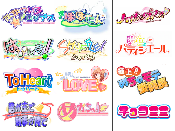
 We return for round two of our analysis of the commonalities of visual novel logo designs. Last time we looked at the similarities of crying girl games. This time we are looking at fun/comedic bishojo visual novels. This was the second type of logo that stood out just as strongly as the sad girls in snow games. They too have this distinct easily recognizable formula to their logo design that instantly tells you what sort of game you are picking up before you see anything else.
 What originally struck me about bishojo game logos was that even though they are marketed for guys, the logos are distinctly what you would image seeing for elementary/middle school girls or you could even image them being drawn by said young girls. This sent me on a quest to compare the two.

