 On the advice of Sheentaku I decided to give Baka to Test to Shokanju a chance since he said it seemed right up my alley. I can’t say that the Internet has utterly figured me out just yet. The premise is that after students take the entrance exam for Fumizuki Academy the score get get places them in classes A though F. The lower the class your are in the worse the facilitates are with the A class having the newest fanciest of everything and the F class has everything that is about to collapse. The classes can use an RPG battle system to defeat other classes and switch rooms with them. So the F class declares war on the rest of the school with the two main characters being their trump cards. Akihisa Yoshii, the main guy is a punching bag for Minami Shimada the tomboy is is clearly in love with him. Mizuki Himeji, the main girl is just sort of a genius Hyatt but not any more interesting than that. The trap, the pervert, and the rest of the school seemed standard character types. Yuuji Sakamoto looks like me might be interesting but I am sure they will under use him. Also Minami was way too violent for no reason for me to get into her character. I never disliked any part of the show unlike say The Familiar of Zero but it also never drew me in or made me laugh.

![]() This past weekend with some friends in toe I went to the Tatsunoko VS. Capcom event being held at Nintendo World in NYC. Usually at these little gatherings you can get a copy of the game early, but not so this time around. Though you could win a copy by beating out everyone else in the game tournament. Of which there were tons, or atleast I think there were, maybe they were all just in line for the autograph and poster as seen above. In any case, talk about packed! Luckily we caught glimpses of the game as we were waiting in line. I am happy to report many people playing as Joe the Condor (as they should be!) who is basically the reason I want to play this game myself. Actually I was happy to see everyone really playing an array of the hefty cast. I did get to play for a minute at the end where I doubled up with Joe the Condor and Viewtiful Joe and promptly got trounced by Gold Lightan! Looking forward to this release so I can try again.
This past weekend with some friends in toe I went to the Tatsunoko VS. Capcom event being held at Nintendo World in NYC. Usually at these little gatherings you can get a copy of the game early, but not so this time around. Though you could win a copy by beating out everyone else in the game tournament. Of which there were tons, or atleast I think there were, maybe they were all just in line for the autograph and poster as seen above. In any case, talk about packed! Luckily we caught glimpses of the game as we were waiting in line. I am happy to report many people playing as Joe the Condor (as they should be!) who is basically the reason I want to play this game myself. Actually I was happy to see everyone really playing an array of the hefty cast. I did get to play for a minute at the end where I doubled up with Joe the Condor and Viewtiful Joe and promptly got trounced by Gold Lightan! Looking forward to this release so I can try again.

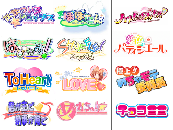
 What originally struck me about bishojo game logos was that even though they are marketed for guys, the logos are distinctly what you would image seeing for elementary/middle school girls or you could even image them being drawn by said young girls. This sent me on a quest to compare the two.
