Watching Dragonball Z Kai and Yu-Gi-Oh 5D’s just got harder.

So a couple of weekends ago I was checking out the Saturday morning fare of cartoons. The channels were run through from Nicktoons to Cartoon Network and finally to the CW where it stopped at an episode of Dragonball Z Kai followed by back-to-back Yu-Gi-Oh 5D’s episodes in a block known as “Toonzai.” TV stations nowadays always have their logos in the right corner and many more have some information running in the left corner perhaps telling you what is coming up next, etc. But I was pretty shocked when this came flying across the screen:

That bright blue wave, with a dude surfing atop it, with orange glow lines coming off him . . . not part of Yu-Gi-Oh 5D’s which is playing behind it. And though I didn’t capture the sound, he actually yells “TOONZAAAAI!!” as he hurtles across the screen. Let me reiterate that the show is going on when this happens, characters were talking and events were happening yet all of that is obscured by the obnoxious logo that tells me something I already know: that this is part of the Toonzai cartoon block. This happened during Dragonball Z Kai as well and I can only assume in all other shows in these timeslots. What exactly is being accomplished here that wouldn’t be if it were just in the left-hand corner of the screen without sound? The complete disregard for the audience is phenomenal.

Visual Novel Logos Part 3: Oh the drama.

Round Three visual novel logo designs! In the last two posts we looked at the two most easily spotted designs for visual novels: crying girl games and bishoujo games. Our last article is about fantasy games, being that Fate/Stay Night is in this category I obviously have a good deal of interest in the topic. Fantasy visual novels usually have more complex and intricate plots than other visual novels. I will admit it was harder to get logos for this section compared to the 200+ logos I downloaded for the other two posts. I had to call upon twitter to get enough logos to feel comfortable about writing this. I would like to thank ClarissaG, Rainbowsphere, animeiscartoons, janaiblog, and wildarmsheero for all suggesting titles and saving me from having to pour through The Visual Novel Database for hours.

When comparing all three logo posts side by side, it becomes immediately obvious that each approach is very different. And that is what you want to have happen! Logos are meant to tell you something and give you an immediate feel to what you are going to be seeing (using, eating, whatever, etc.). Overall I saw a little more variety in the fantasy visual novel genre but you can see glean some common properties from them. There is a feeling of complexity to these logos that is composed of not only the many pieces involved by each piece having a flair of it’s own.

The first thing that stands out about fantasy game logos is they always have huge symbols in the background. They are usually ornate and just as important as the title as part of the logo. Where in other games any background symbol is usually merely an accent or a mascot the symbol in a fantasy game in an equal partner with the logo. The games usually have the title with bold and heave lettering with much smaller type for the subtitle. The gravity and darkness of the game is usually identifiable buy how dark the lettering on the logo is. This text usually appears on a straight line with only a minor bit of flair to the writing to make it stand out. Fate/Stay Night is a good example. The red and black command symbol in the background tells the reader that the game has a darkly mystical feel.  The letter of the text back this feeling up but mostly lets the symbol do the talking.

Color palette plays less of a role in these logos, you can see everything from pink to blue used, but there is a darkness creeping in to them. This move from dark to light can give a ominous feeling to the logos and establish that perhaps the story seems light or starts in a mild direction but opens up to something deeper. The type itself has a sharpness to it, either in the letters themselves or the formation they are in or both. Then there is the tell-tale symbol with the logo, in these cases that symbol usually represents something in the series rather than being an abstract object to establish feeling as seen in the previous visual novel posts. I see the complexity and layers of the logo as a representation of the story being told throughout the series.

I am always curious if other people agree with our observations or have other good examples to add to our case files. Other than that I leave the next part up to our readers. The 4th most obvious category for visual novels is horror games like Higurashi no Naku Koro ni and Saya no Uta but I could not come up with a common design aesthetic for their logos. If anyone wants to try and find a common design I am curious what they find. Also if anyone can find logo similarities in other types of visual novels I would like to hear about that as well.

Visual Novel Logos: Part 1 Part 2

February’s Final Denouement: The mysterious use of screentone in OEL.

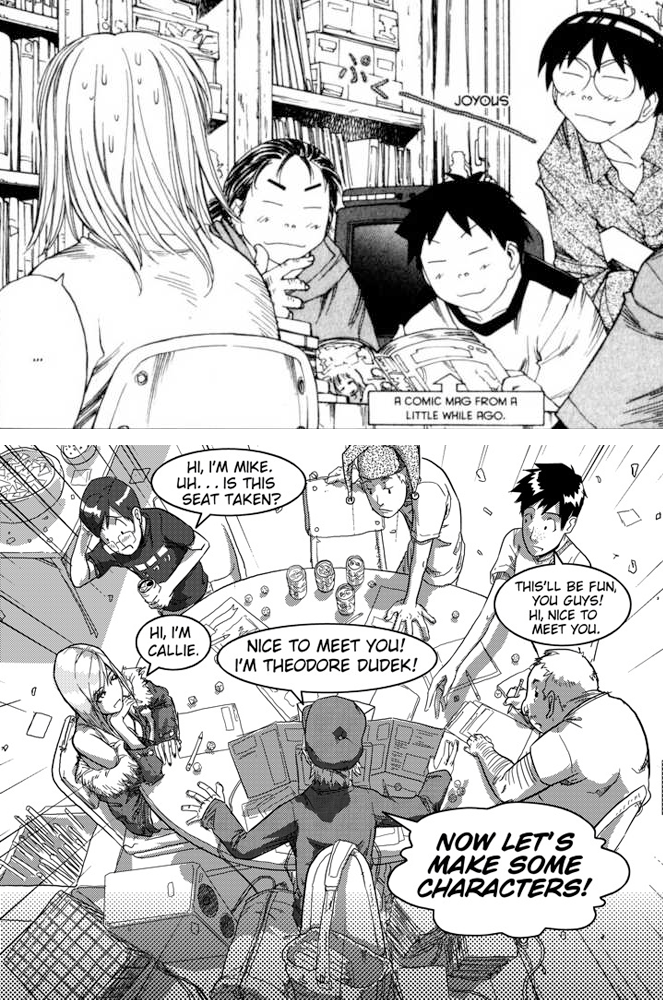
Because of a random comment that occurred while looking at pages from King of RPG’s, I found myself taking a closer look at the use of screentone in manga the past couple of weeks. Essentially the comment was that something about the way OEL uses screen tone feels different from manga which it is supposed to be derived from. But what exactly was the difference, well, that required closer inspection, thus I type before you now.

Screentone use in manga I came to feel, or realize, was lending texture, pattern, the idea of color, or providing emphasis or deemphasis as it may be, and even creating mood. The characters themselves were often devoid of tone, except maybe a pattern on their clothing or perhaps their hair, with little shading.

And shading is where I started to feel the difference. Screentone in manga is used more flatly, whereas in OEL there is depth emerging. Characters in the foreground were not being given pattern with screentone, but instead were being shaded extensively with it in OEL. When screentone was showing up in the background of manga, it was more for pushing back the image in order to let the foreground characters pop. It was also lending a mood or feeling to the events occurring on the page. Contrastly in OEL, backgrounds were becoming less abstract with more of an emphasis on perspective. OEL is attempting to create a more multidimensional space using screentone as the central tool.

Randomly, I feel that digital screentone is still working the kinks out. This method is quite popular in OEL. I won’t say I can always tell when it is being used, but it can be easier to pinpoint. There is such a crispness to the lines when working completely on the computer that it becomes more obviously manufactured. There is a disconnect from the slight fuzziness that happens when scanning in a work of art.

Since all artists have their own styles and quirks there are always going to be exceptions and incidents here and there. But I think I have come to grasp some of the basic general uses of screentone in manga and OEL and the differences that can be seen. While I can’t say what has caused OEL to move in this direction, perhaps it is just a western emphasis on a more realistic aesthetic. The more I looked, the more I came to find OEL to have this emerging stylization even if only by accident.