The Speakeasy: A Reverse Thieves Podcast – Drink #001

Surprise! Anime 3000 presents: The Speakeasy

If anyone remembers, we had originally planned to make The Speakeasy our monthly rant section on the blog. That became the Final Denouement. The Speakeasy has instead become our monthly podcast. We hope everyone is cool with the change. We know we are super excited! We will being doing a monthly podcast which is generously being hosted courtesy of Anime 3000. The goal is to have a meta-podcast. There are already so many good anime and manga podcasts that review so much that we wanted something a little different. The Speakeasy is going to be a ongoing conversation between the two of us about themes, trends, and concepts present in anime and manga and along side that sometimes there will be a critical analysis of fandom. If you were ever curious about our conversations that are the genesis of our posts then this will be utterly enlightening. If you never wondered about that, hopefully you will still enjoy the show!

Drink #001: Bloody Mary, A discussion of strong female characters
We decided to go back to the roots of the blog for our inaugural podcast. We start off with the initial question: Is anime actually filled with good, strong female characters or is that dream much like a Satoshi Kon movie? The discussion then unfolds as we look at what our initial expectations of strong female characters were when we started watching anime, the realities of the medium, and its future.
(Listen) (Show Notes)

And now your helpful bartenders at The Speakeasy present your drink:

Bloody Mary
* 1 oz. to 1 1/2 oz. (30-45 ml) vodka in a Highball glass filled with ice.
* Fill glass with tomato juice
* 1 dash celery salt
* 1 dash ground black pepper
* 1 dash Tabasco
* 2-4 dashes of Lea & Perrin’s Worcestershire sauce
* 1/8 tsp. horseradish (pure, never creamed)

* Dash of lemon or lime juice
Garnish with celery stalk.

May be shaken vigorously or stirred lazily, as desired. Garnish with a celery stalk; a skewer of olives, pickles, carrots, mushrooms, or other vegetables; or even meat or fish (salami, shrimp, etc.) and cheese. Occasionally, pickled asparagus spears or pickled beans are also used.

Visual Novel Logos Part 2: Bloggers just wanna have fun!

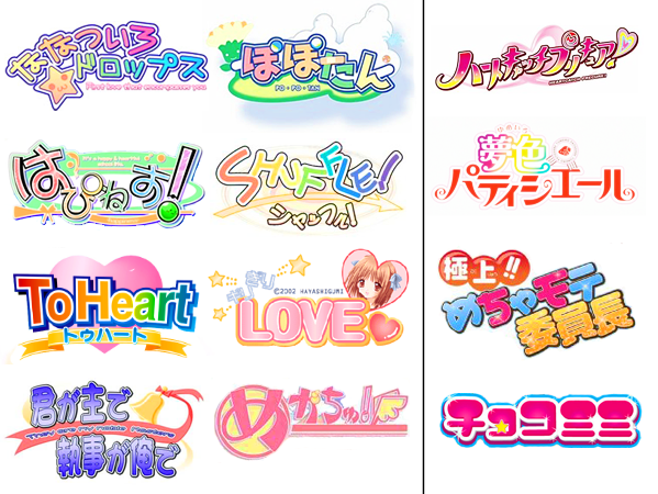
We return for round two of our analysis of the commonalities of  visual novel logo designs. Last time we looked at the similarities of crying girl games. This time we are looking at fun/comedic bishojo visual novels. This was the second type of logo that stood out just as strongly as the sad girls in snow games. They too have this distinct easily recognizable formula to their logo design that instantly tells you what sort of game you are picking up before you see anything else.

What originally struck me about bishojo game logos was that even though they are marketed for guys, the logos are distinctly what you would image seeing for elementary/middle school girls or you could even image them being drawn by said young girls. This sent me on a quest to compare the two.

These are the happy fun visual novels usually based around comedy. Unlike the crying girl games which are supposed to invoke a feeling of the beauty of sadness these games are supposed to be an energetic tribute to hot girls. And having sex with said hot girls. The lettering of the logo is always big and bold with rainbow colored letters. There is then a subtitle with smaller uniformly colored text but if tends to be just as neon crayon colored as the title itself. The lettering seems to bounce around. Although how asymmetrical it is varies from logo to logo. There is usually a colorful abstract shape in the background and/or mascot along side everything else. The Shuffle! logo is a perfect example with it’s pastel rainbow colored logo, colorful whirlpool in the background and it’s uniformed colored arrow and much less rainbow colored subtitle. Overall I feel that the logo is supposed to invoke a lighthearted festival feeling. They are meant to invoke a fun, energetic, humorous feel. I have to agree 100% with what Narutaki said about the designs looking like they were draw by an artistically talented elementary school student or at least something aimed at said student.

You can click the image above to show more logos and also see a comparison to logos made with young girls as the target audience, more on that in a few. What hits you first when looking at these bishojo game logos side by side is the overall color palette which immediately brings out a light-hearted feel and removes even a remote possibility of worries (unless you’re worried about having too many girls to choose from). Even without the mascot or icon that many like to add in to these designs, there is a sense of fun and energy present. The actual type can vary but it always has a boldness to it and the use of a double stroke, usually a white or light thick stroke around the type followed by a black or dark thin stroke. The color palette here is bright, but when looking at the logos for young girls, you can see they are in the same vein but tend to be more saturated. The visual novel logos are actually more feminine, more girly than the ones actually aimed at girls. If I may be philosophical for a minute, it’s like the difference between what girls are like and what guys think girls are like. But commonalities should be clear including the boldness, the off kilter line of type, and the use of strokes. They actually evoke the same feelings (well, minus all that fan-service)!

I am once again curious if other people agree with our observations or have other good examples to add to our case files. The next one should wrap this series up unless someone wants to provide some examples for different distinct genre design. Please look forward to our next visual novel logo article.

Visual Novel Logos: Part 1 Part 3

Ongoing Investigations: Case #071

At some time in the past I used to have some amount of skillz, but no more. Nothing has proven this more than me playing the New Super Mario Bros. Wii. You can play it like a standard Mario game in which case it plays pretty much like every old school 2D Mario platformer. It really reminded me of Super Mario Bros. 3 quite a bit. The other way to play it is is multiplayer which just adds to the madness. The second you add another player on the screen the game changes completely. It makes many things in the game that were simple very hard and several hard tasks very simple. If you play the game with the right people it will add to the fun especially if you use the bubble trick during some scrolling parts and if you use the team ground pound. Also partners can make getting the coins so much easier. But if you play with some other people death by scrolling and “stolen” powerups can lead to some petty grudges. Our little group pretty well together. We beat the game proper without too much difficulty but having some very good players did not hurt. We still had to go back and get all the star coins but I think we had a great time.

Playing New Super Mario Brothers Wii with 4 players is the only way to roll, seriously. It is fun, it is insane, it is hysterical, and it is deadly! Biggest issue that we all had was when someone would get hit there would be a slight pause of delay which totally threw off your rhythm causing much mayhem and plenty of extra deaths. This was never more evident than in the hidden world in World 8 with the rollercoaster-like contraption. I also found the game to be the right mix of difficulty, which is certainly ramped up with multi-player. While I agree that is references Super Mario Bros. 3 a lot, I think it really took a ton for Super Mario World, possibly my favorite, and things from Mario 64 and even Super Mario Bros. 2 U.S. This game was a wonderful culmination of great pieces from each older game and I have faith that when they make a sequel, they had better make a sequel, that they will fix some of the annoyances and add even more fun stuff! I can’t recommend this game enough, it’s a gem, Mario’s still got it!

Continue reading