 It has been said that sometimes great design is great because you don’t notice it. It brings you the information you need without you having to struggle but doesn’t impress itself upon your mind, unless of course you are looking for it. Design, when it is good, can be an unsung hero that enhances your experience but for the most part goes unrealized. This is no less true when it comes to manga page layout. There are a lot of approaches to page layout to be sure, but I’m choosing to focus on Swan because it accentuates manga design so well and is an amazing sight to behold. (I apologize for the crease in my scans; all images can be enlarged)
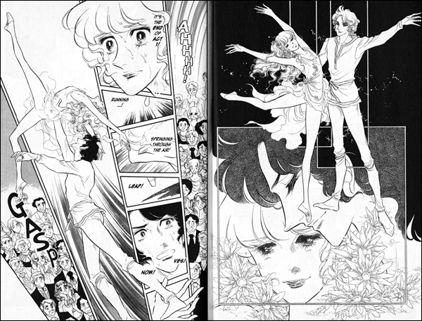
The most basic function is obviously to lead the reader’s eye through the story. But page design can do so much more. Using the above image you can see the calm of the right page contrast with the chaos of the left. This chaotic feeling is achieved through the angles of the boxes and the way they fit together. From this a momentum starts to build up. Then the way the dancer is swept into the air where her toe points into the negative space your eye follows through the action. You literally might find yourself taking a breath like the gasp the audience utters as the movement leads you to the next page. Moving on to another example, the following spreads come one after the other.
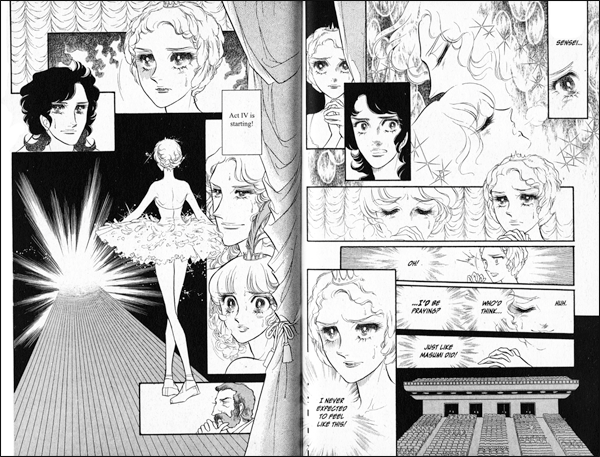

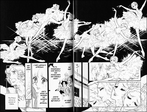
One basic theory when laying out image with text is keeping each two-page spread fresh. The pages leading into and following a spread shouldn’t look the same. In the sequence above no page has the boxes laid out in a similar fashion. The scale of images is different, too; the first spread ending with a large image which leads to a page of finer detail. Even the use of black is different from page to page. There are many more ways of creating a contrast between pages. Thinking about how pages lead into each other, the artist can create a build up of drama as well. A burst of light concludes the first spread enticing us to the next. The end of the second spread depicts the dancer bowing forward giving that much more intensity to her pose and subsequent movement on the third spread. When holding a manga at arm’s length you might not be able to read it, but you should still get a feeling from it.
As we all know, with manga there is a balancing act of showing us what is happening verses telling us what is occurring on the page, the layout of these elements is a helpful tool for creating mood, emotion, and drama even if it can be on a more subconscious level. But just because it doesn’t always occur to the reader doesn’t mean it isn’t affecting the enjoyment of a manga. I myself enjoy page design and can’t help but notice it. I don’t know if Swan is the best design out there, but it certainly ranks at the top for me. This is by no means a definitive article but more a hope that by pointing out some elements others will talk about it more and maybe pick up Swan in the process.

I’ve always loved Swan for the gorgeous layouts. Thanks for sharing these panels.
I think manga really excels at showing every moment of the story in a subjective way. You can almost look at every panel and see how the artist composed it to achieve maximum emotional affect on the reader. I’m not the biggest manga fan yet but I really dig a few manga artists and it’s because their work achieves an emotional intensity most western comics can’t. Panel composition, tone effects and page design all come together to bring a reader into a story if an artist uses the tools at their disposal. Thanks for the post!
I always pay attention to page layout. It’s one of my favorite parts of manga, and comics in general. I started reading Swan solely for that reason (I’m a guy, and almost never read shojo…I’m pretty sure it’s the first shojo I’ve ever bought). I’ve come to appreciate all of it, of course, but the pages are delicious.
Swan is such a beautiful manga. Do you know if it got licensed by another publisher? I would love to keep reading it…
No license rescue as of yet. But I keep asking publishers!
-Naurtaki
Go to buy amazon.co.uk by Swan 1-15vol. Lucky i bought all today from these amazon.co.uk. but haven’t come yet on 16-21vol completion.